DeepDive: Better healthcare environments when children are given a voice

At White, we firmly believe that children should be involved in the creation of the spaces that they’re going to spend time in. In 2020, the Convention on the Rights of the Child became law in Sweden, which stipulates new requirements for how we work with the participation of children in design. But how does this work in practice? When Queen Silvia’s Children’s Hospital in Gothenburg was being expanded, we used play and dialogue to capture the children’s perspective and let their wishes guide the design.

The rebuilding of the Queen Silvia’s Children’s Hospital had been underway for a while, and although work began before the Convention on the Rights of the Child became law in Sweden, it was included as a self-evident part of the process. Over the course of the project, children at the hospital and their relatives were involved in various ways, and they were asked to give their thoughts on what mattered to them. This included spontaneous meetings in the entrance, as well as dedicated playshops – a sort of workshop with play as a tool. Among other things, this resulted in lots of drawings where the children themselves illustrated their wishes. These drawings then adorned the main entrance while the project was underway.
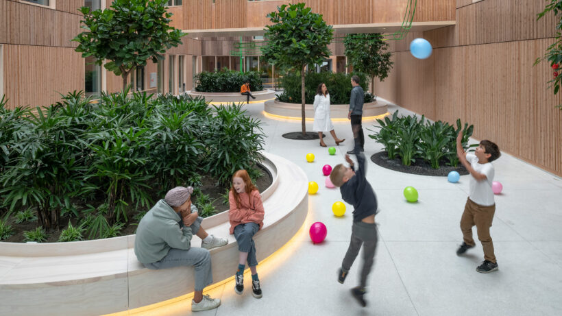
 

Playfulness is a major element in our design. The hospital supports recovery through play and positive distraction, both inside of the building and outdoors.
Cristiana Caira, Lead Architect at White

“On the other side, it is important to shape spaces of calmness and homeliness. To find the right balance between these two different types of spaces has been crucial during the design process and stake holders engagement,”says Cristiana Caira.

Above all, it was clear that the children wanted a feeling of being at home and of being able to feel ordinary, as well as the things that we can all relate to – a sense of belonging, a sense of strength, and a sense of being able to get through things.

But children of different ages of course have different needs – what suits a five-year-old is not the same as what a teenager needs. There must be environments that cater for the very youngest as well as those who are approaching adulthood. Today, a large part of young people’s contact is digital, and they can just as easily talk to someone in the same situation as them and with the same illnesses on the other side of the world as they can to someone on the other side of the same ward. Consequently, the digital provisions of the rooms were incredibly important, but so were the areas where people could retreat for some alone time with their phone or tablet.

When it comes to healthcare environments for children and young people, it’s uncommon that people go to the lengths we have in order to understand their needs as part of a project, yet it’s so important to do so.
Susanna von Eyben, Lead Interior Designer at White

Together with the hospital, the children’s thoughts and ideas were taken further into the design process and translated into a basis for the design. An outcome from this was a stronger colour scheme with happy colours. Each patient’s room has also been given its own colour to signal a space that is unique and safe. This means no two rooms are alike, meaning even the youngest children can find their room themselves, as well as making it easier for staff to find their way. This is a clear example of how affirming a child’s perspective can make the environments better for adults as well.

It’s about ensuring that there are spaces for activities like music and socialising, where the children can feel well and like anyone else. Many of them spend several months here. Consequently it’s important for them to live an everyday life, where they can leave the intense moments behind for some time in the peaceful light courtyard where hospital materials like stainless steel are counterbalanced with wood and warmth, despite the requirements for high levels of hygiene. The furniture design should not be reminiscent of other public environments but should have a more modern and youthful design language.

Choosing healthy materials has been very important. Young children spend a lot of time on the floor and enjoy exploring all the different surfaces with their hands or mouth. As a result, it’s important to use natural materials such as wood, while the floors are made of rubber instead of plastic. These materials give a cosy feeling and are durable enough to be touched and to put things on.

At the same time as the hospital is a place for children, young people, and their families, it is also a workplace that should exude professionalism and serve as a home to an advanced enterprise. This balancing act is embodied in the three keywords of the project – “playful”, “secure”, and “professional”.

It’s not a playground – it still has to be an environment that fosters trust, an environment where the best healthcare in the world is provided. At the same time, playfulness adds something important to large-scale, rational healthcare environments, making them human and cosy.
Krister Nilsson, Lead Architect at White

Another challenge is the need for flexibility, which makes it difficult to tailor the environments to any great extent. A hospital is a major investment that will be in use for a very long time. If necessary in the future, it has to be capable of being adapted and becoming home to new activities without any major intervention.

When you get off the tram, the children’s hospital is the first thing you notice. From its coloured façade, it’s impossible not to know what’s going on there, and this helps people to find their way.

“The families who come here are in a vulnerable situation. This is a strange environment for them, and so we want to de-dramatise the situation by using the expression of the building,” says Krister.

The entrance is home to the play therapy facility, and the lush courtyard with its artwork in the form of a marble run six storeys high arouses curiosity. This is a playful environment that approaches children on their level and sets the tone from the outset.

In the more private areas where the families spend time, everyone has their own room with a terrace. Some rooms even resemble small townhouses with gardens. The presence of family is importance, which is why each patient room has been designed to look after the whole family and can accommodate two relatives. The relatives room features a full kitchen where families can cook the food that their children are used to at home and not just heat it up.

There are five major artworks, including the marble run, which together play a vital role in the design and are integrated into the building. By using the children’s perspective as a leitmotif, everyone is invited to play or explore. Play is part of the rehabilitation process, while the art is much more than just decorative, as it stimulates and encourages recovery.

Another of the works is a huge painting with a motif comprising smaller figures. Each figure is unique and can be found in the patient rooms, which helps to provide a sense of identity, belonging, and recognition. At the beginning of their stay, the child may be unable to move outside their own room. When they start to feel better, they can go down to the painting in the entrance and find their figure there. By stimulating the child and encouraging movement and exploration, the artwork is also a means of promoting recovery.

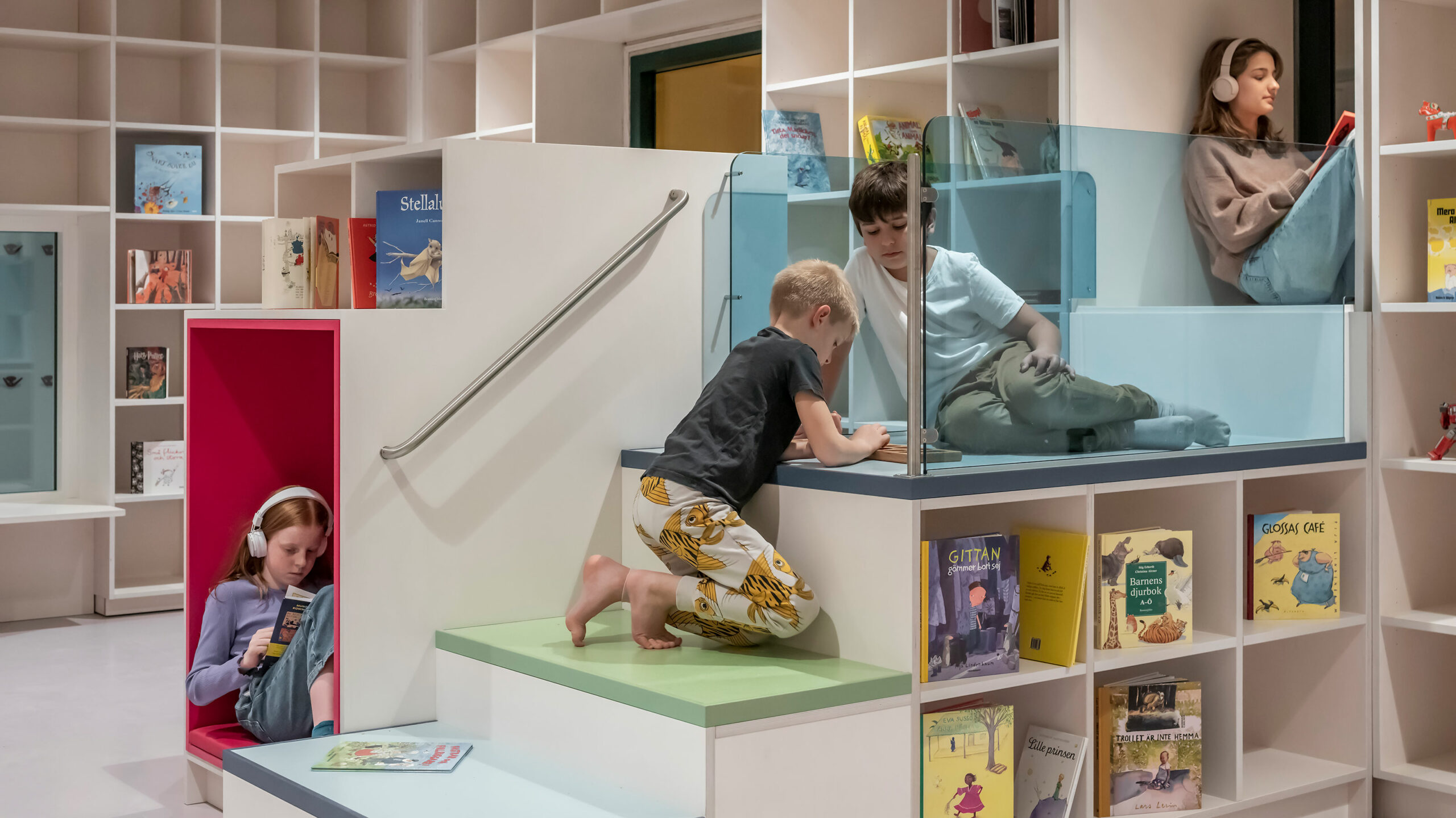
“We’ve applied this approach in several areas. In the library, for example, we have niches and windows at different levels in the room. This stimulates movement, and when the child sees that they’re able to get to new places where they were unable to climb before, this is a natural confirmation of their recovery and gives them the sense that they’re going to get through this,” says Susanna von Eyben, Lead Interior Designer at White.

Lead Architects: Krister Nilsson and Cristiana Caira
Lead Interior Designer: Susanna von Eyben

Please share!