Emergency Depart­ment, Danderyd Hospital

Emergency Depart­ment, Danderyd Hospital

Danderyd Hospital’s new emergency department is the hub of the entire operation. The evidence-based design of the architecture, with its good navigability, colourful environments, and lush greenery, helps to alleviate patient and staff stress.

The heart of the hospital

Stockholm is the fastest-growing city in Europe. Healthcare facilities need to adapt to this situation. Hospitals must be able to offer more people the latest treatments using the latest technology.

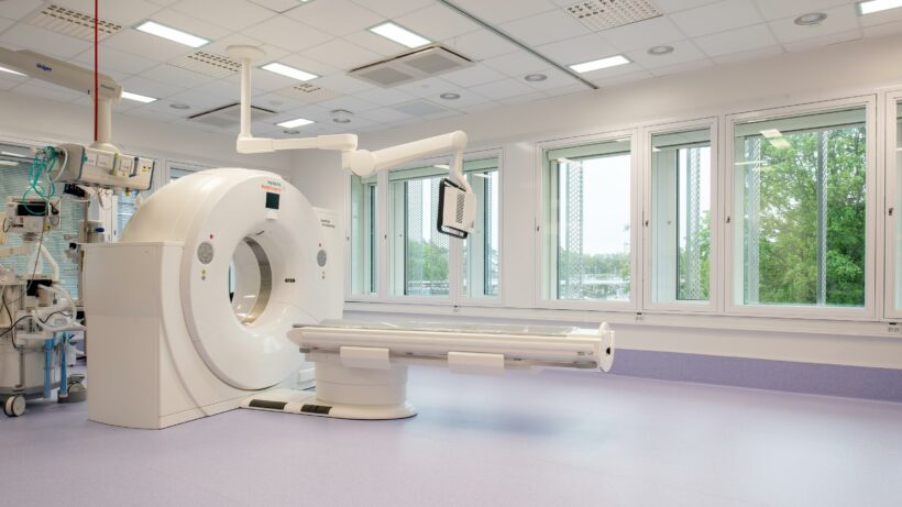
The new emergency department is at the heart of Danderyd Hospital and serves as a hub for the entire operation. The various floors house the emergency department, an imaging and utility department, an intensive care unit, an intervention unit, a surgical unit, and a sterilisation unit. These facilities often operate 24/7, with patients being taken care of around the clock, all year round.
Client: Locum
Location: Danderyd
Status: Completed in 2019
Area: 27,750 square metres
Awards: Plåtpriset 2020 – PLÅT20
Photo: Anders Bobert

The building is the new heart of the hospital.

A matter of life and death
What happens within the walls of an emergency department is a matter of life and death, with people going through difficult times, concerned relatives, and dedicated and hard-working staff who help patients to get well. This requires a lot of the design and the layout. As a result, White has sought to establish clarity in the layout in order to provide a carefully designed environment.

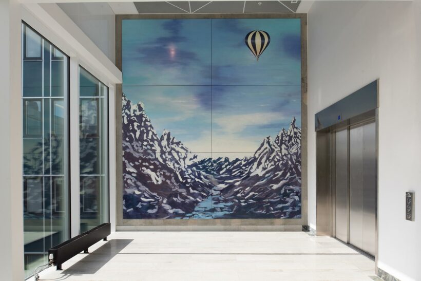
The stairwells in the facade are flooded with light to make them feel safe and secure. Here you can also look out over the surroundings, which is important for experiencing the passage of time and seasonal variations. Large windows let natural light into spaces that, in older hospitals, were left in the dark. The basic structure also allows for remodelling should needs change in the future.

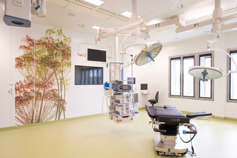
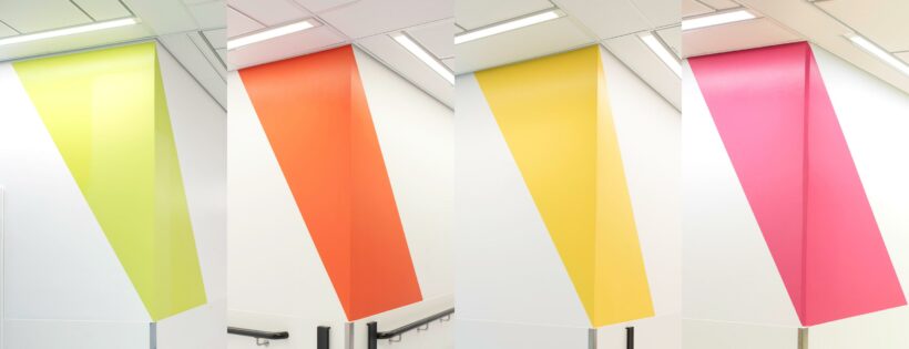
Evidence-based design (EBD) for hospital environments has been applied to both the building’s architecture and the landscape architecture. According to EBD research, wayfinding can be used to reduce stress as it aids easy and intuitive navigation. This complements conventional signage and is underpinned by the building’s clear structure. We’ve taken this work a step further in the new building by way of colours, arrows, and lighting. Everything is integrated into the general colour scheme, which is happy and playful.

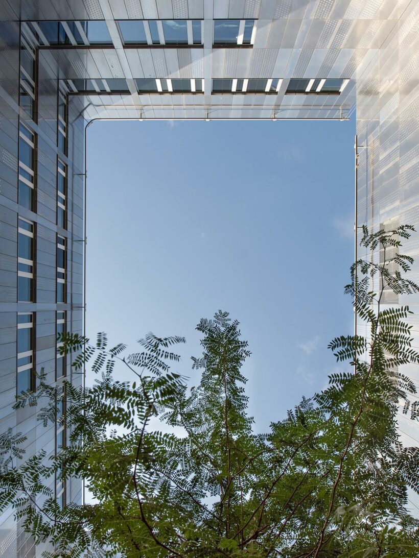
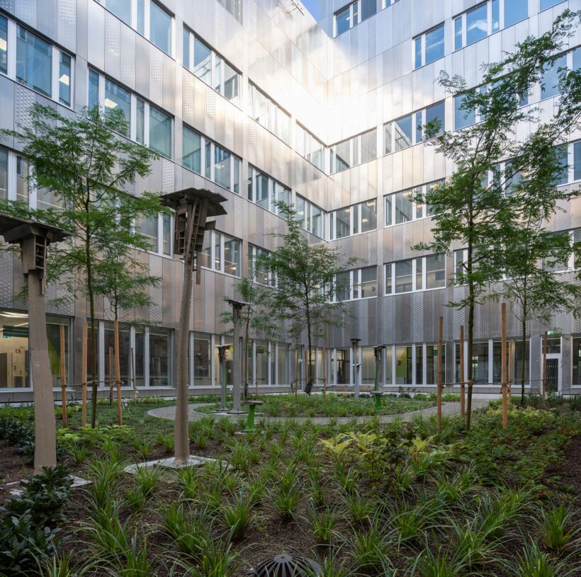
It has been hugely important to work with courtyards, equipping them with natural materials and lush greenery, making sure that at least one tree can be seen from each and every window. Research highlights the importance of greenery in reducing stress and lowering blood pressure.

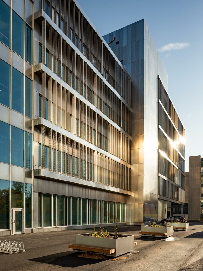
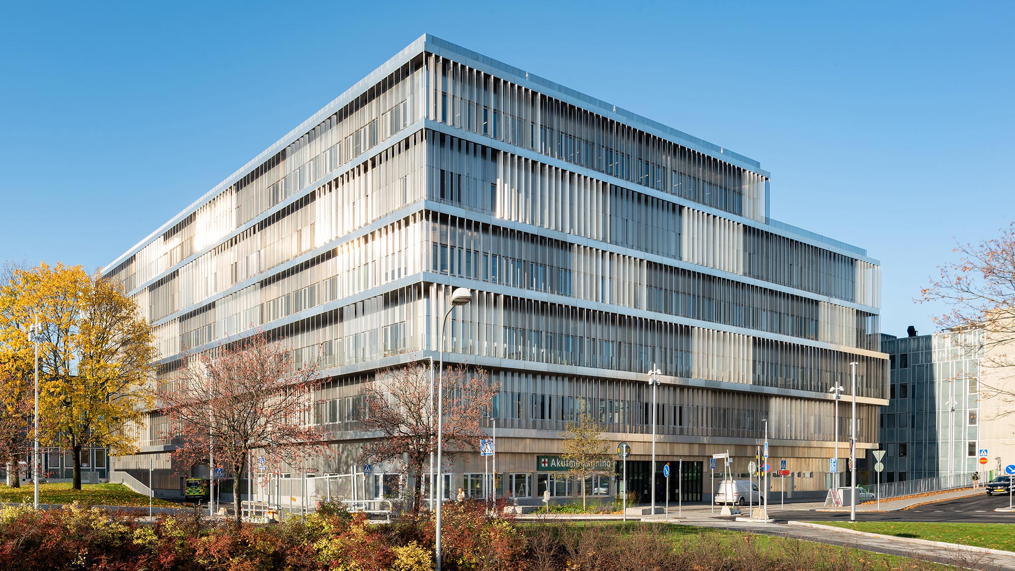
The first buildings at Danderyd Hospital were brought into use as early as 1922, but the buildings that give the hospital its clear character were built in the 1950s and 1960s. The patterns of the facades have inspired the design of the new building, whose facade is a three-dimensional interpretation of the existing buildings. The appearance of the emergency department blends in while retaining its own unique expression.

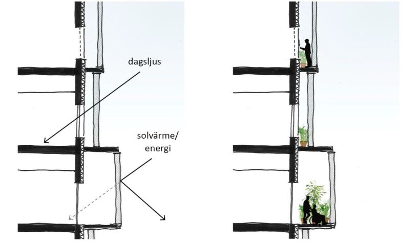
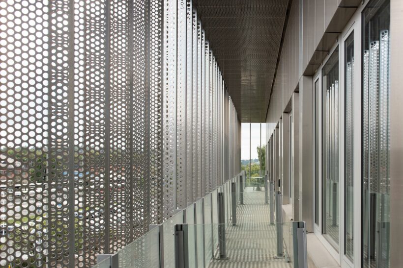
The facade is made of aluminium – a silver box whose shape changes as you move around it and as the weather changes. The balconies and perforated slats form a protective layer against solar heat and act as external curtains, which are essential in such a technology-heavy and heat-generating environment as a modern hospital. However, the facade does more than just protect against wind and rain. The balconies make it easier to maintain the facade while giving patients and staff a space to go outside and get fresh air without having to leave the department.

Playful and colourful environments
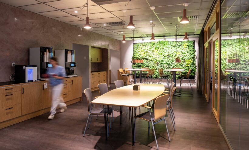
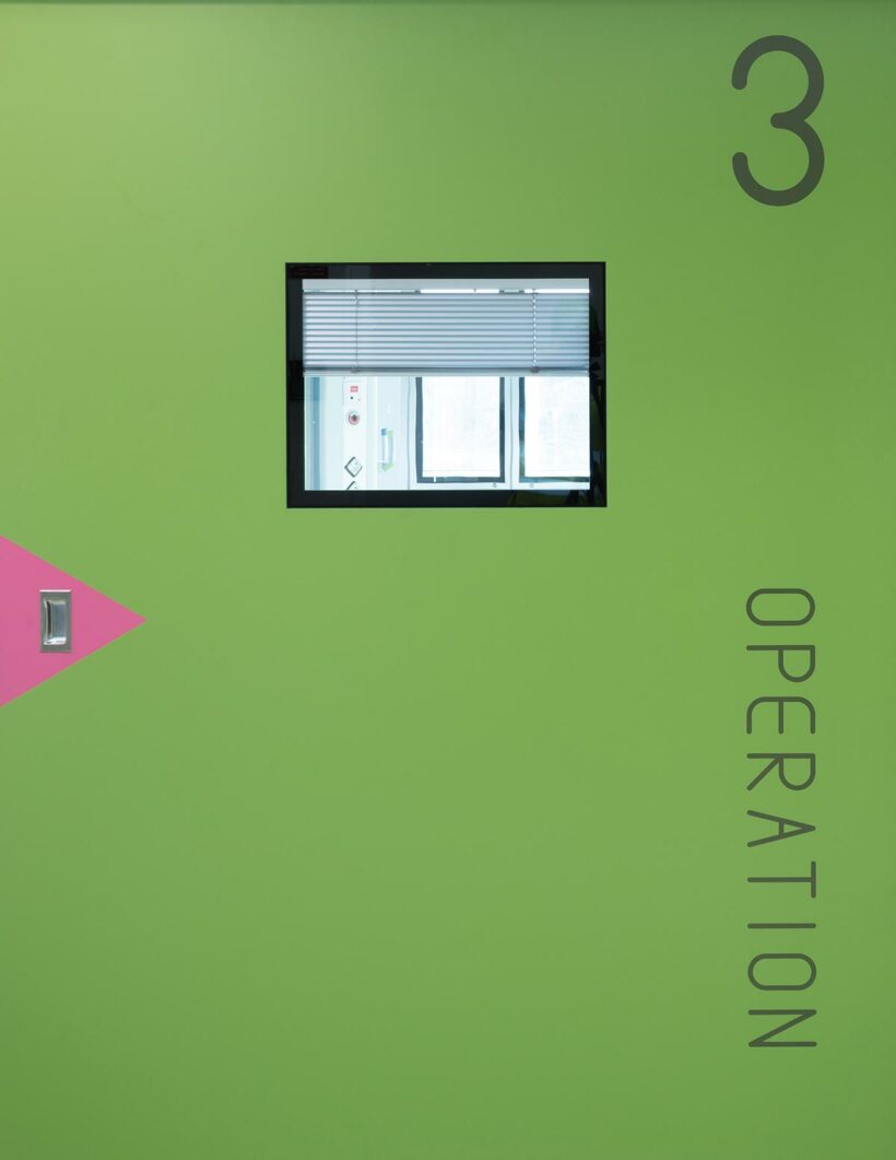
Inside, the focus is on adding warmth, playfulness, and colour to the environments, so the interior is both colourful and graphically designed. Each floor has its own colour scheme with different colours on the floor, a number of base colours on the walls, and a signal colour for each floor to emphasise the important parts. The tiles behind the sinks in the corridors and bays are in signal colours to remind people of the importance of washing their hands in the fight against resistant bacteria. All doors to rooms where patients spend time have an arrow in a signal colour to show that the space is accessible to anyone.

There is a separate font for certain doors to better enable people to find their way and orient themselves. Arrows in signal colours on the walls and as light fixtures show the way.

Green spaces and biodiversity
The trees and skeletal soils of the surroundings as well as the green roofs take care of surface water. The planting of sedum on the roof supports biodiversity and helps to replace the green area on which the building has been constructed. Thanks to strict sustainability criteria, the new emergency department building has been provisionally certified as a gold-level environmental building by the Sweden Green Building Council.

Innovative new technology

Large amounts of data are involved in large and complex healthcare projects. This project was the very first to use the Revizto visualisation software as part of the extensive review and anchoring process that always forms part of hospital projects. Spaces and interiors were visualised clearly and accessibly in 3D, which allowed us to understand and accommodate the needs and wishes of hospital staff. A tailor-made 3D model using the same software is also used to train staff working with operations and administration.

Contact & Team

Helena Polgård Nygren

Helena Polgård Nygren

Architect

+46 703 96 26 80

Helena Polgård Nygren

Lead Architect

Gustav Söderberg Röstlund

Erik Miron

Cecilia Jarlöv

Vladimir Ondejcik

Ola Lindblad

Åsa Carlestam

Please share!

Related projects

All Projects

Loading...